The Re-Brand of Fitness Playground
One of the tasks that kept us busy during the 2020 lockdown, was the re-brand of Fitness Playground.
Originally starting in 2014 as an outdoor bootcamp:
‘The idea for Fitness Playground was born out of frustration. We wanted to change the gym environment and experience. At gyms I’d worked in, there wasn’t a huge emphasis on the member experience and staff weren’t looked after.’ - Justin Ashley, Founder
Since it started, the company was constantly evolving. So naturally, the brand needed to reflect this.
During my role as Head of Creative, along with the team, it involved a few moving pieces. But let’s take a look at the journey.
Part 1 | Where it started
In 2014, Fitness Playground’s iconic brand colours were black, yellow & white. Have a look at where the branding started from:
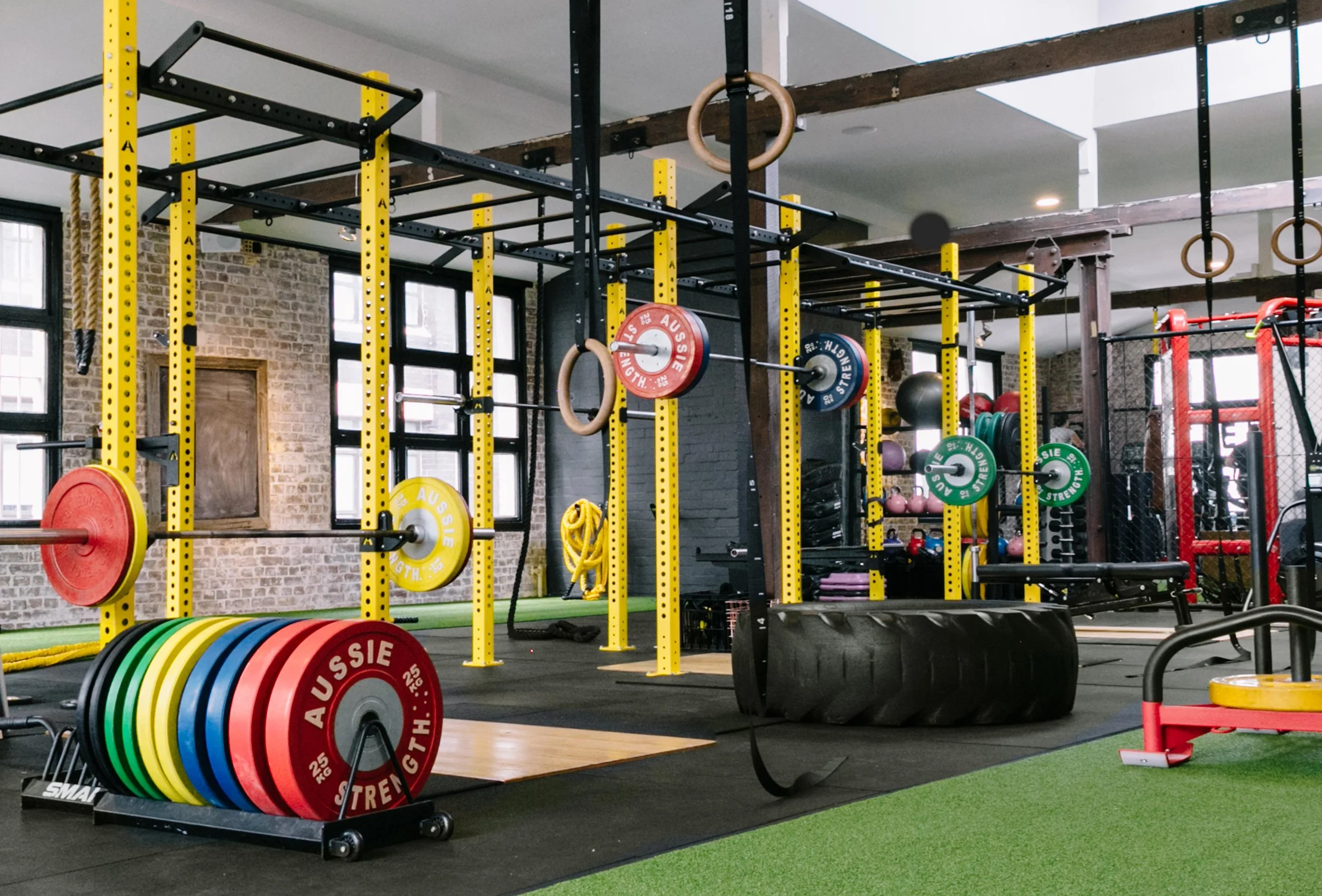
Each physical gym space embodied a similar look & feel. They consisted of green-grass functional playgrounds, open free weight areas, dedicated cardio zones, ‘Sweat’ group fitness studios and ‘MindBody’ wellness studios. Come down memory lane and have a glance at some of the original pictures below:


Part 2 | Reinventing the brand
Fitness Playground started with the problem:
‘Most people don’t like the gym. We struggle to get people to show up, let alone see results. Even with more places to train, our health is worse. We are failing in our fundamental duty to make Australia healthy physically and mentally. Something needs to change.’ - Justin Ashley
And from there, built the new brand to address this.
Brand mission:
To inspire change.
Brand proposition:
The fitness industry is broken. Members feel intimidated, bored and confused. Services are outcome-driven. Businesses choose cash over culture. Brands lack purpose. Staff are unsupported and underprepared. As a result each of them fail.
Fitness Playground solves each of these problems. We are the catalyst for a better fitness industry, for members and staff.
Brand values:
Great humans
Better everyday
Design the future
Do cool sh*t
Most people don’t realise the importance of brand values. These set up the foundations of your brand, and from a creative perspective, what you produce is derived from this.
Part 3 | The new logo
From here, we redesigned the new look of the brand. We moved away from the use of yellow in the logo, keeping only the black & white. The new mission of ‘Inspire Change’ needed to be complimented with a more premium feel.
But of course, we still kept the iconic yellow through-out elements of design, especially for the website (you’ll see later).

Part 4 | The new imagery
As we started to delve into the website design, we wanted to create new imagery that reflected the new brand & mission.
Our brief was to create highly emotive, aspirational, but real imagery.
We used our coaches, instructors and members of the playground to bring this vision to life. We showcased our key class categories including Fight, Strength, HIIT, Calisthenics, Barre, Yoga and Dance, as well as our Coaching.
See some of the shots below that we captured during the lockdown (one of the only perks of having the gym spaces free).
To carry across the energy, we put our subjects through their paces (imitating a real training environment), using a staged class format, complimented with specific lighting, a smoke machine, and being selective of the time of day we shot.


And not to mention the facility imagery. This happened over time as each space was upgraded, but here’s an idea as to how they were shot:
Non-peak hours (to avoid member disruption)
Deep cleans of the gyms before the shoot
Each shot being staged perfectly (and yes, that meant reordering all the dumbbells)


Part 5 | The new website
What started as a simple 10x page website, slowly evolved to much more.
As a simple overview, it looked something like this:
Homepage
Gyms (main page plus 5x individual gym pages)
Classes (main page plus 10x class category pages)
Coaching (main page plus 30+ individual coach pages)
Careers
Gallery
Resource Centre (blog articles)
Cool Sh*t (events, news, innovation)
Book a Shoot
Contact
This project took place over a few months, and involved copywriting for all pages, SEO infrastructure and all new imagery & video content. And bucket loads of testing.
Have a peruse of how it turned out:

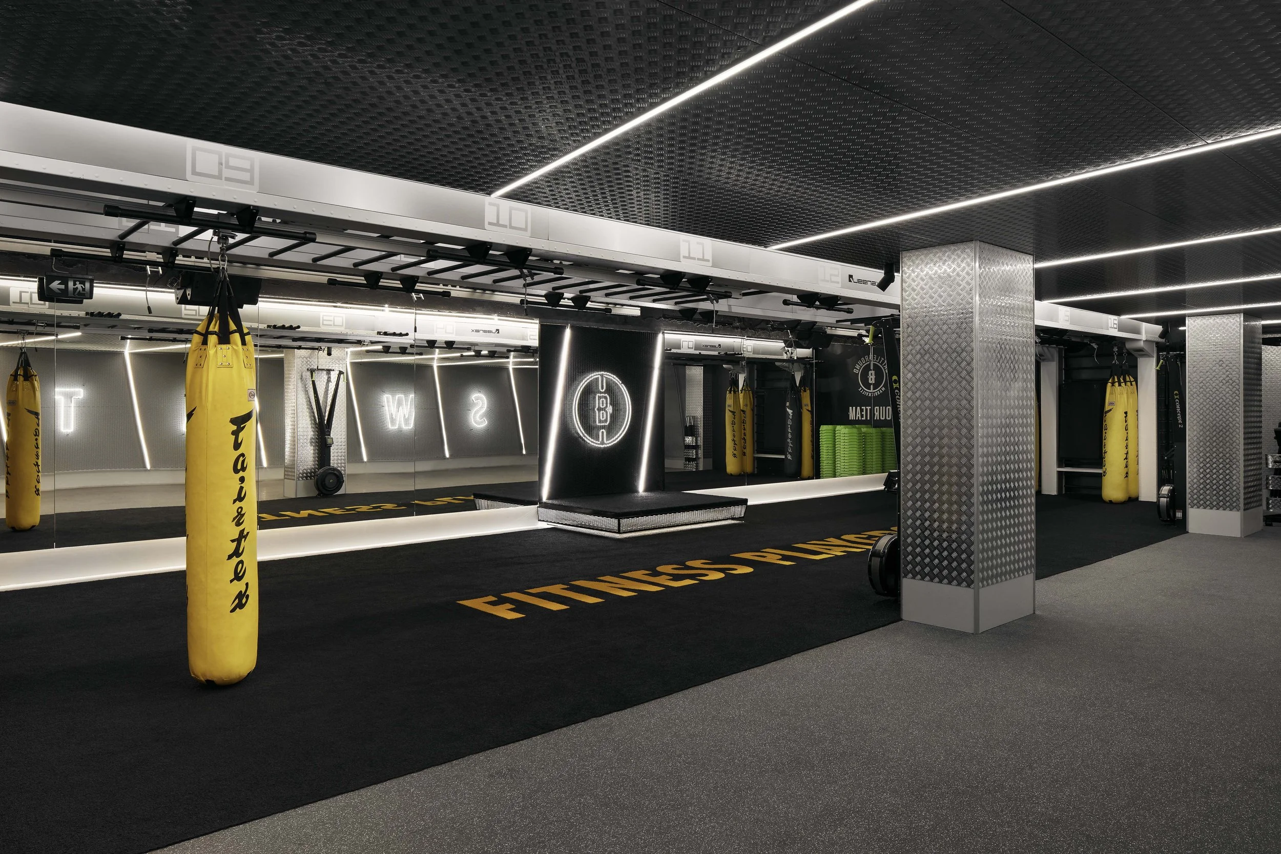
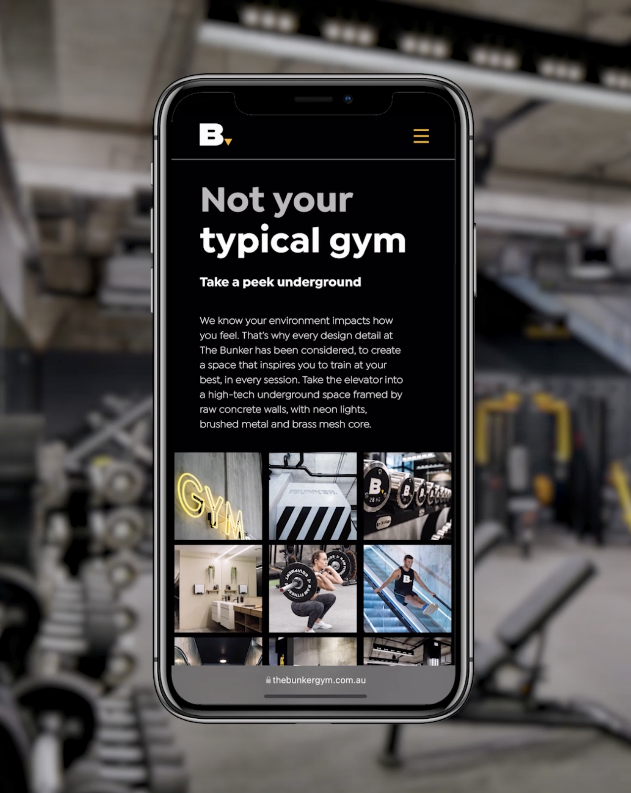
Oh, and we also upgraded The Bunker website (a sub-brand of the Fitness Playground gyms).
Located underground, The Bunker was dubbed Sydney’s Best Gym by Men’s Health, boasting a premium fit-out with equipment sourced from all over the globe.
And there you have it. A little glimpse into the process behind a brand re-birthed.
What is important to take away?
A hard (economic) time, does not mean you need to stand still. What can be done in the quiet to be bigger in the loud?
Brands are ever-evolving. It doesn’t need to be perfect, but everything you create needs to be committed and true to the long-term vision
Use your people in any way that you can
Share the evolvement with your customers. Let them know something is coming, or what you’re working on, or where you see the future. They need to be part of the dream
Thanks for reading.
__
Brand: One Playground
Creative & Art Direction: Alessia Murer & Alice Lo
New Campaign Photography: Lester Jones
Interior Photography: Ryan Linnegar
Graphic Designer (website): Catalina Kiprislian
SEO: Digital Architects
Web Development: Surge Global